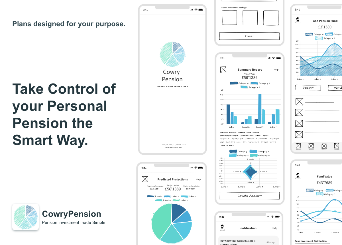


CowryPension is a digital platform that guides individuals to invest in pension plans based on their investment style and profile. The digital platform provides a transparent simplistic approach to make it easy for anyone to invest in pension plans with confidence. Their vision is to make retirement planning fun, hassle-free, informative, intuitive and accessible to everyone.
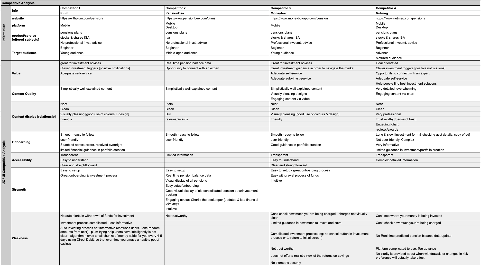
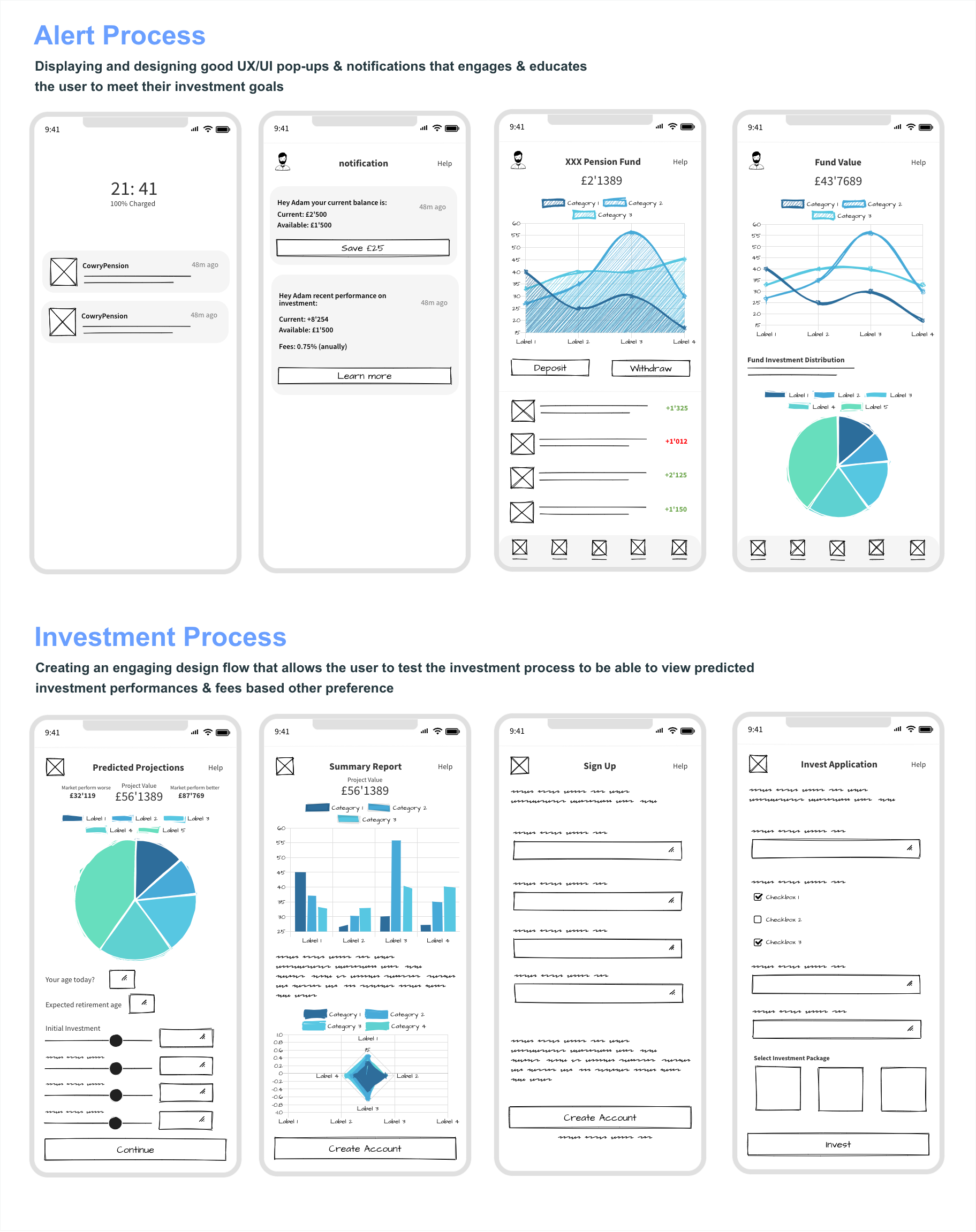
Financial Services tools aren’t the most exciting products to use, they can feel cold, boring, and very corporate. As complex tools with tons of functionality and customisation, most provide insufficient training and education. The challenge was to address potential investment challenges a client might face when using these financial services to select the right investment. A UX Analysis was designed to explain CowryPension’s services and products to its users (clients), encourage it’s clients to register, be able to provide informative simplistic information to its clients, and to help it’s clients to make good investment decisions for their retirement plan.