client
at www.hangerz.com
sector Social , Dating , Networking ,
project time 3 months
my role Entire product design from research to conception, visualisation and testing
my contribution
  • User Interviews
  • Visual Design
  • Prototyping
  • Research
  • Survey Analysis
  • Front-end Development
services
  • App UX/UI Design
  • Responsive UI designs
  • Tools: Adobe Photoshop Adobe XD Invision App
  • Languages: Ruby & Rails React-Native HTML & CSS
team
Richill ARTLoe(UX/UI Designer)
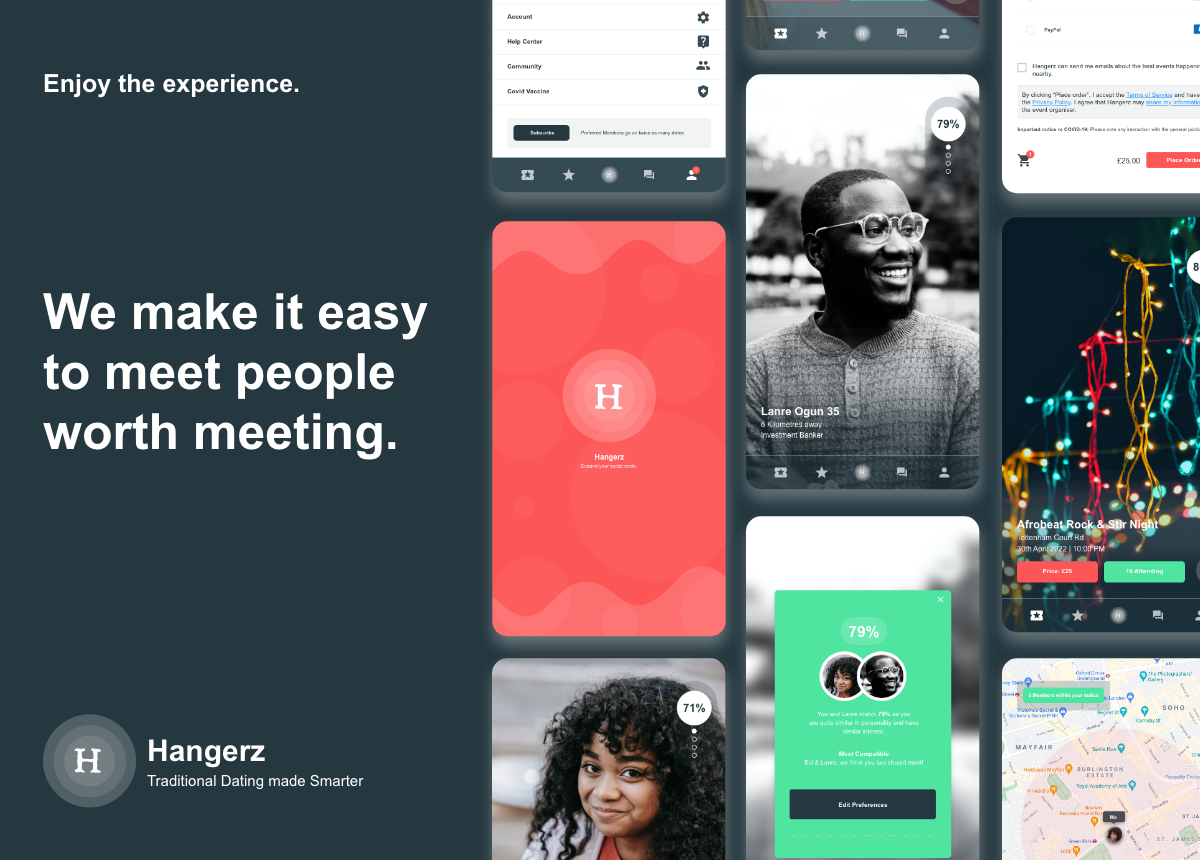
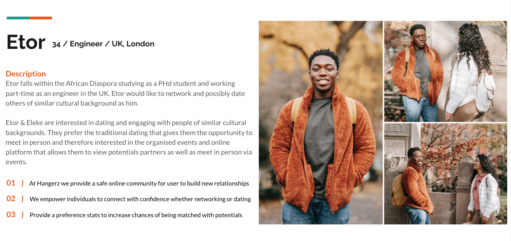
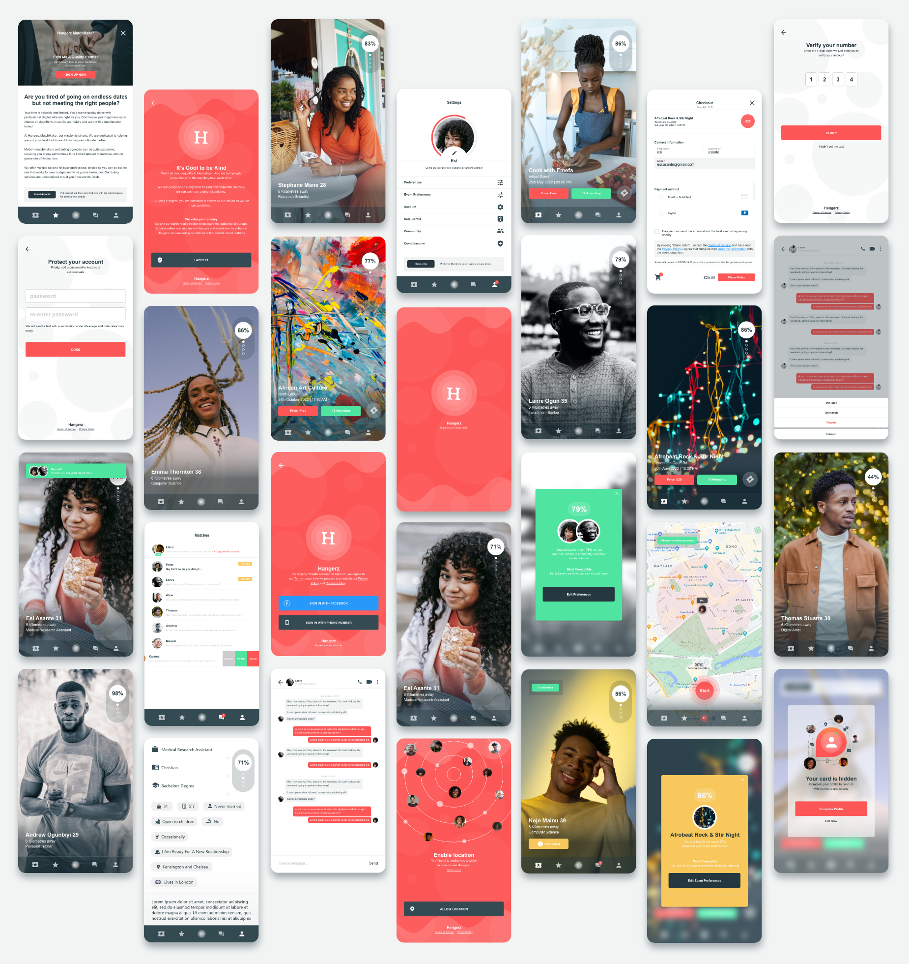
Hangerz is a social app that helps users engage with nearby people through the discovery of socials & virtual events. Hangerz empowers users to connect with confidence whether networking, dating, or meeting friends online. The mobile app prioritise kindness and respect, providing a safe online community for users to build new relationships.
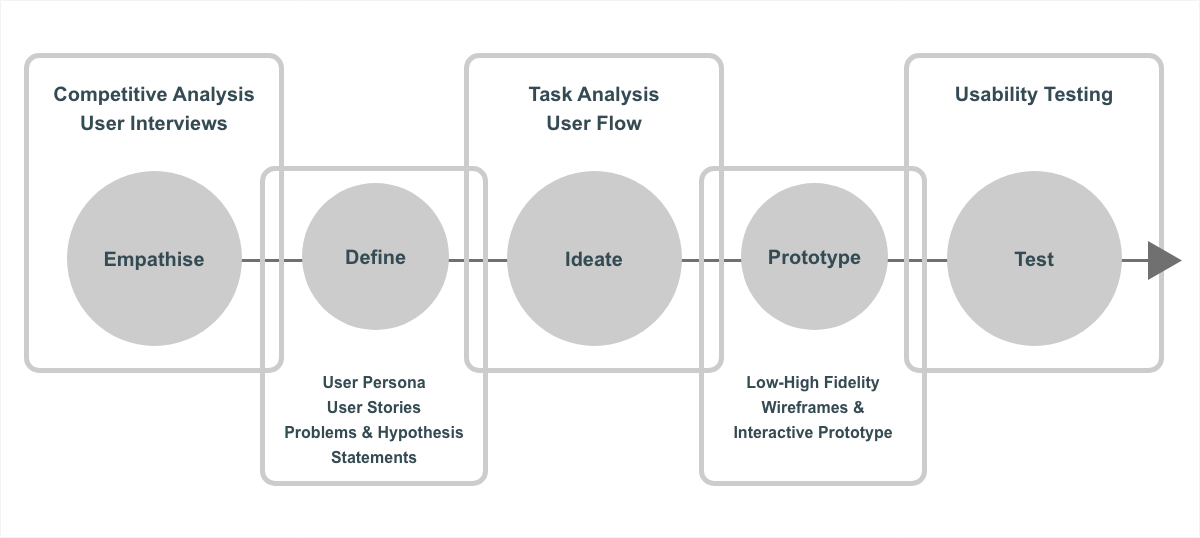
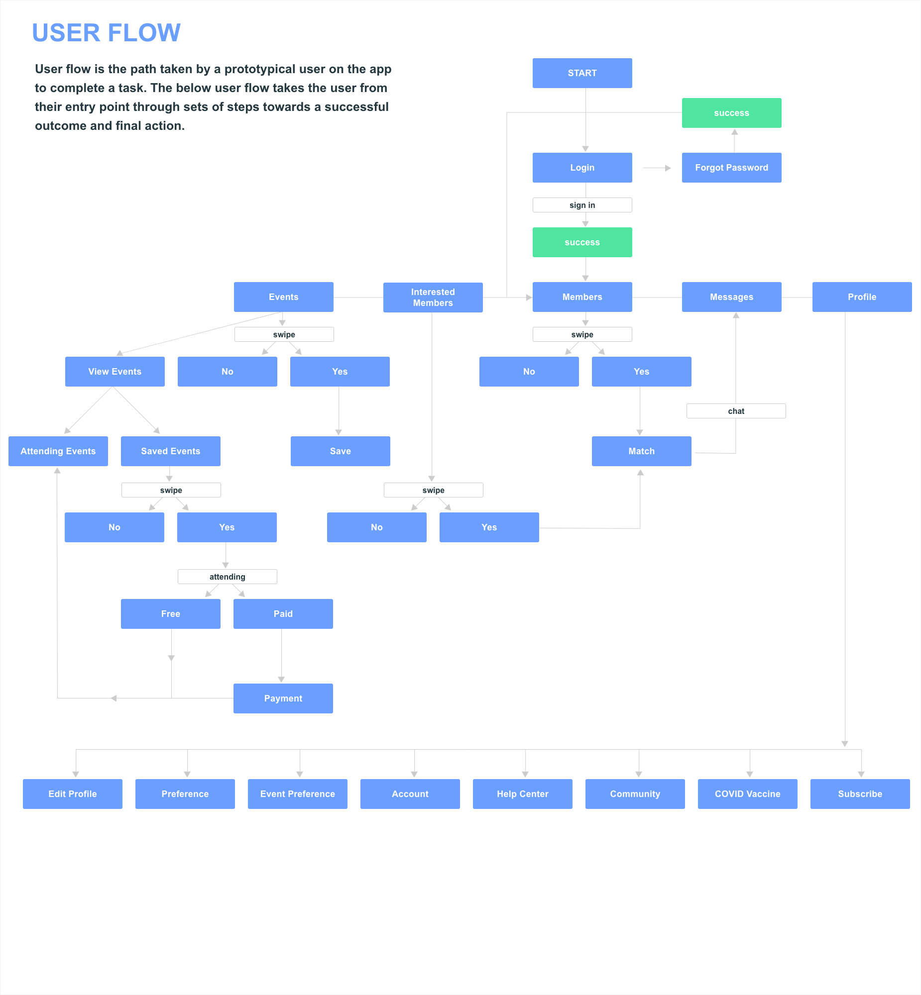
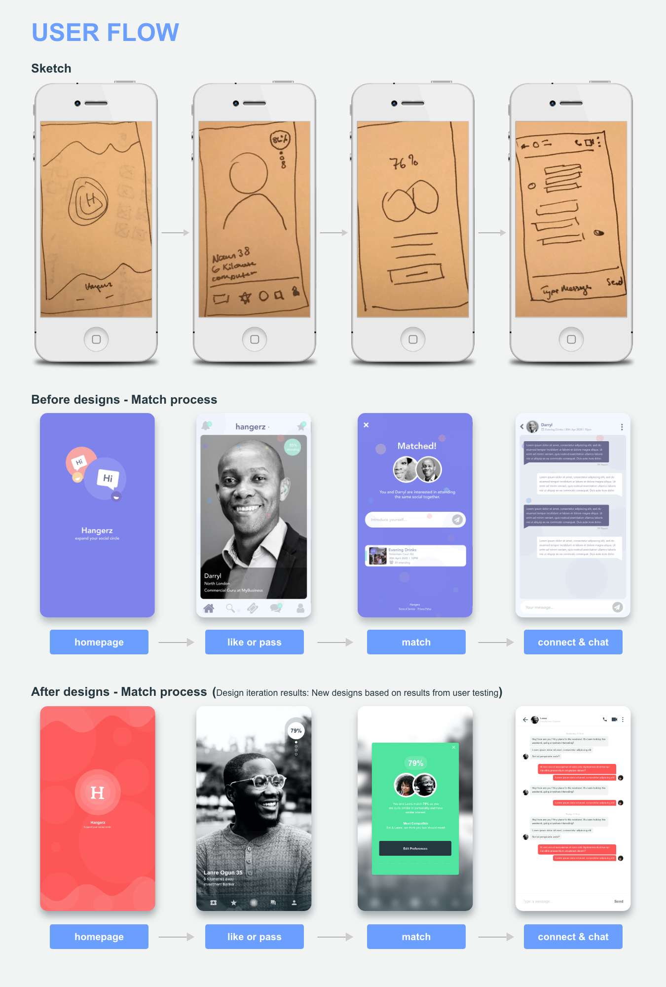
A UX Review of the subscription and match process was completed. We delivered a user flow experience and testings that served to maintain conversion KPIs while decreasing negative feedback and experience. This project was accompanied by a three-month user experience design testing, it is to be followed by a planned digital implementation. The project helped to deepen my knowledge in the user experience design & to explore approaches in the digitisation of the social dating space.
methodology
Design Process: The diagram displays the Design Thinking Process to be utilised in order to design the solution (when focused on the needs of the users).
problem statement & solution
How might we improve the UX/UI experience and process for the business & users.
  • problem statement #1
    User's Experience - Problem Statement

    Monica just recently moved to London. She loves meeting new people and since she is new to the city she feels that this a good opportunity for her to create new relationships. Monica needs a way to meet and engage with new people of her preference in a fun safe environment. She is also interested in a serious relationship but feels that websites like Tindr, Plenty of Fish etc are too un-serious and do not tailor to people of her preference and therefore does not feel noticed as much as she would like to be. This creating the frustration of Scrolling endlessly through incompatible profiles.

    Hypothesis
    We believe that by creating a visually oriented and appealing interface, we are able to put together an app that helps users engage with nearby people through the discovery of socials & virtual events. An app that allows Monica to meet people of her ethnic preference and that provides Monica with more stat info on potential matches.

  • problem #1
    lack of analysed compatibility/Lack of dating success

    Most networking & dating match apps do not analyse matches based on interest, preferences, personality and appearance. Random members are displayed to registered users, giving registered users an unpleasant and tiring experience of finding a successful match. This lack of analysed compatibility becomes tiresome and creates an unpleasant user experience and eventually results is an increase in members unsubscribing.

  • solution #1
    increase user engagement by creating a clear and frictionless journey

    Increase subscription through maintaining the interest of members via an engaging analysed match process that increases the probability of successful matches. The aim is to create a clear and frictionless journey, and in doing so we can expect to improve brand perception while maintaining and supporting an increase in conversion.

competitive analysis
An assessment of the strengths and weaknesses of current and potential competitors.
So far, based on research there is currently only one successful direct competitor that offers analysed matches in a displayed swipe format, "Hinge”, so the research will apply mainly to this competitor. The creation of the competitive profiles (in terms of marketing strategy, target market, core business, usability, layout, navigation structure, compatibility, content, design and performance) together with SWOT analysis helped to assess current indirect competitors in this sector. Also, due to general disadvantages of using a social matching app due to the lack of analysed compatibility, prompted the question of how to build a user confidence through the UX/UI design flow and how to integrate reliable data match coverage, was an important part of the research. view in-depth detail of competitive analysis
swot analysis
  • s
    strength
    • Higher success in auto-matches due to analysed matches.
    • Increased engagement ie: increased conversion due to analysed matches
    • niche target audience
    • several independent ways to generate revenue. Hangerz is designed to be affordable and easy to use for the average user. Such user-friendliness will attract many users and make the app very popular.
  • w
    weakness
    • privacy concerns
    • difficult to enter the market
    • the lack of information on users, about themselves raises the problem of not being able to find the perfect matches.
    • vulnerability of user information
  • o
    opportunities
    • Ability to create a niche dating experience
    • premium plans can expand popular features
    • Can diversify business by foraying into the matrimony market - where there is a huge market prospect in that space.
    • ability to improve matching algorithm using new tech eg: face recognition
  • t
    threats
    • Strong competitors that offers similar products
    • Financially strong competitors replicating algorithm process
    • The fast progress and advancement of technology may raise the threat of the appearance of new rivals and may put HangezApp application and services at a disadvantageous position
    • The company may confront the problem of legislative changes which may interfere into its operations, such as the ban of tracking users’ information
challenges UX/UI
Challenges in the user experience & flow
  • challenge #0
    Creating an engaging matching experience for members
    Displaying pop-up guidance and informational stats on members that are likely to be matched, giving the user a more informed experience in having a successful match. In this way, the experience in finding a successful match on the app becomes more engaging, pleasant and less tiring.
  • challenge #0
    How to improve the subscription experience for subscribers
    Identifying the possible user struggles in-order to highlight insights that will improve user experience to subscribe. Using hotjar on the invisionApp demo provided a general understanding on areas of visitor struggle, current UX issues and some knowledge on technical issues which all ultimately contributed to visitors leaving the app.
  • challenge #0
    How to Improve members trust

    Displaying a verification tick, to provide users with confidence that majority of members are verified members with authentic accounts and creating a frictionless journey to allow users to be verified on the app. This being a significant key driver to enable members to provide honest information. 

challenges - sector
Challenges in the Social , Dating , Networking , Sector
  • challenge #0
    The lack of a niche site for the Nubian community

    For many within the African & African-American community, the experience on mass-marketing dating apps like Tinder and Match.com has been unfulfilling. Usually Black millennials are misjudged & typically have to send 10x the number of messages as their counterparts to receive a response & a possible match.

  • challenge #0
    lack of analysed compatible matches
    The lack of an analysed matching system. Most networking & dating match apps do not analyse matches based on interest, preferences, personality & appearance, therefore, random members are displayed to users, giving the registered users an unpleasant & tiring experience in finding a successful match.
  • challenge #0
    the lack of offline potential matches

    Though online dating has it's convenience, there is still a large percentage of individuals that prefer to engage and meet potential partners in person in a fun, safe and chilled environment. There are currently no platforms with an inbuilt matching system for offline socials that ensures compatibility & mutual interests prevails.

findings from interviews & survey
With the knowledge of Design Thinking, interviews & suverys were conducted to gain feedback in order to iterate throught designs. Collected data from user interviews was analysed and synthesised into key findings. User statistics were also explored through graphical representation.
  • interview questions #1
    Interview Questions

    1. What is your age?

    2. What do you do for a living?

    3. What social dating apps do you find most effective in meeting new people?

    4. Generally, how do you find the experience of using the social apps of your choice?

    5. How could these experience be improved?

  • survey questions #1
    Survey Questions

    1. What is your gender?

    2. What is your marital status?

    3. What is your age range?

    4. What social dating apps do you use more often?

    5. What are you interested in when using these social dating apps?

  • key findings #0
    attracting the wrong type of connections online in comparison to offline

    Users expressed that, at times they felt that online dating could be rather shallow. They expressed, they did not have much success on online dating, as majority of the time, most matches were based on looks and therefore, many connections were not genuine like old school dating. This was found to be frustrating.

  • key findings #0
    lack of compatible matches
    Users feel majority of times, on matching apps, a mass number of un-analysed members are displayed on their screens. Many online & offline match-apps do not focused on matching members based on interest & preferences, therefore, random members are displayed to users, giving the user an unpleasant & tiring experience of finding a successful match.
  • key findings #0
    Members do not feel noticed enough

    For many within the African & African-American community, the experience on mass-marketing dating apps like Tinder and Match.com has been unfulfilling as members do not feel noticed enough by others of their preference & therefore not given the opportunity to present themselves as who they are.

user persona
Building empathy
Using the quantitative and qualitative data from interviews and survey results, A main target group was defined. Synthesis of user research lead to the creation of 3 primary user personas. These personas were considered when making any further design decisions.
  • "I want to feel more noticed by people of my preference"
    Monica
    age: 28
    job: Marketing Consultant
    education: MA in Management
    status: Single
    Monica is a high-end working professional. She grew up in Ghana/Accra and just recently moved to London. She loves meeting new people and since she is new to the city and area she feels that this is a good opportunity for her to create new relationships. Monica is single and also interested in a serious relationship but feels that websites like Tindr, Plenty of Fish etc are too un-serious and do not tailor to people of her preference and therefore does not feel noticed as much as she would like to be.
    goals
    To create friendships and potential relationships
    Potential dates
    Meeting attractive and interesting guys
    tasks
    Looking for guys of her preference
    Finding attractive matches
    Finding matches within her radius
    Frustrations
    Not meeting people of her ethnic preference
    Guys sending in appropriate messages
    Often matched wrongly with others out of her preference
    how Hangerz helps
    Hangerz can help in case you have specific preference
    Convenience in meeting people nearby
    Offers traditional dating if online dating has not been successful
  • "I want to be more informed analytically of potential matches"
    Edem
    age: 31
    job: lawyer
    education: PHd Economics
    status: single
    Edem is a PHd student. He loves hanging out with his friends and playing sports. Edem recently ended a 2 year relationship and is ready to start meeting new people. He believes that the app would be a good chance for him to take his mind off his previous relationship and give him the chance to meet new women and build new connections with others. Edem is not interested in a serious relationship, he wants to meet new people and see what happens.
    goals
    To find attractive people around him
    Taking his mind off previous relationship
     Quick and easy way to view different people nearby
    tasks
    Meeting interesting fun people nearby
    Scroll through profiles of his preference
    Viewing organised socials/events with potential matches
    Frustrations
    Not meeting people looking to have fun & hangout
    Pressure in being in a relationship by potential matches
    Not able to see potential matches nearby
    how Hangerz helps
    Provides visual map to view potential matches nearby
    Convenience in meeting people within preference
    Provision of match stats to view likely match potentials
  • "I want to consistently view 'quality' potential matches within my preference"
    Esinam
    age: 43
    job: Self-employed
    education: MA in Law
    status: Single, 1 child
    Esinam is a single mother running her own Real-Estate business. She loves home renovations and real-states development. She also loves meeting with friends for an evening drink. Esinam is single and currently looking for a serious relationship. She doesn't have time to be scrolling through endless profiles and would like to be able to view potential matches quite quickly. She also prefers traditional dating, so being able to view events with potential matches of her preference is quite important.
    goals
    To meet potential dates within preference
    View potential profiles quite quickly
    Having a stats snapshot of matches likely to connect
    tasks
    Viewing profiles fairly easily & quickly
    Finding attractive matches
    Viewing events with potential matches in her preference
    Frustrations
    Scrolling endlessly through incompatible profiles
    Not finding potential matches within her radius
    Not meeting matches comfortable with her current status as a single mother
    how Hangerz helps
    Offers traditional dating [offline dating]
    Provides analysed potential matches
    Displays potential matches comfortable with Nana's status
User Experience Map (user flow)
Structure of the App - User Journeys
A product-based journey map helped to better understand the matching & subscription phases as well as the user and their experience. The user journey was created to help with the ideation. By mapping these journey, a deeper understanding of the users emotional state when connecting with other members was observed. Using this information helped to identify key features of the application.

usability testing
User research: Qualitative & Quantiative research
  • insight #0
    participants: 6
    age range: 18 - 55
    performed with: Invision app, desktop

    Both quantitative and qualitative research were conducted. The primary goal was to gain insight into the journey of a user when seeking the right match/potential at any potential pain points. This would help us to better identify important feature requirements of potential registered users.

    Analysis - Findings From Interviews & Survey:
    collected data from users interviews was analysed and synthesised into key finding. This was achieved through the use of Affinity Mapping. User survey stats were also explored through graphical representation.

    With a clickable prototype, the next step was to perform usability tests. Due to COVID and lock down restrictions these were remote moderated tests. Users were assigned situational task and their behaviour was observed. Errors were assessed.

  • insight #0
    goal:

    The goal of the test was to identify learnability of the application for new user on mobile and desktop.

    The test will aim to highlight any usability issues and define the usefulness of the application, whiles observing the user completing basic tasks and functions.

    task:

    1. create an account

    2. complete preference

    3. search for a match

    4. subscribe to be a member

    5. add a payment method

  • insight #0
    results:

    Affinity mapping (which is a business tool used to organise ideas and data) was utilised to help track and group observations. This was paired with a spreadsheet to document frequency and severity of error along with common usability issues.

    observations:

    1. Most users instinctively skipped onboarding

    2. More colour needed to be added to the app

    3. App forms [user preference] needed to look more friendly and welcoming

    4. Matching process needed to be more intuitive

    5. Users wanted to see more stats info on potential matches

product designs
Final design ready for development
Display of the UX design. The aim was to create a clear and frictionless journey, and in doing so one can expect to improve brand perception while maintaining and supporting an increase in conversion via subscription.
visual design
Visual designs, Typography, Colours & Icons
The visual design was developed by iterating from mood boards and styletiles to the UI kit and finally to creating a first version of the style guide.
conclusion
Project summary

The primary goal of the startup business was to develop an app that had a great user journey/experience flow to initiate an increase in its subscription sales and also in the general business growth. We played an essential part in creating the UX/UI Design to enable the startup to achieve it's business goals. This was achieved by improving the below user experience and customer satisfaction features, that were to ultimately help increase more registered users and to increase the engagement on the app:

1. smooth onboarding experience
2. quick registration process
3. friendly engaging dating preference form
4. simplistic informative stats on potential user matches
5. smooth user subscription/payment journey flow 

The information architecture, interaction design, usability, wire-framing and visual designs were all created for our client.

learnings
Knowledge aquired through the design & development of project
  • challenge #0
    Be Open To Research And Let Ideas Go

    I thought too digitally and approached the product with less flexibility in ways to approach certain idea features, thus failing to correctly take into account some needs and challenges of the target group and thus was unable to fully defined the right minimum viable product.

  • challenge #0
    If There Was More Time & Budget Available…

    Development of further user personas and Journey Maps would have been created given more time. Additional research service could have also been provided for the client as the business idea was quite complex and extensive (for example, technical and social challenges).

  • challenge #0
    Clear Navigation is a Key to a Positive User Experience

    The client was able to communicate clearly the exact functionalities of the mobile app, in addition with a summarised specification provided. With the provided info, we were able to put together a good UI/UX interface with features such as 1.] search, 2.] auto-matches, 3.] save event/social 4.] how to notes etc. In this way users minimise the time taken for them to find, understand and engage with what they needed.